Diane Young Artist

Printmaker ~ Painter ~ Every Picture tells a story ~ Artwork ©Diane Young


Leave a comment

Paths of least resistance!

So many ideas and so little time! I mean lots of people have ideas and don’t necessarily go with any of them at all, but one of the difficulties of knowing that you are going to create something is ruling out all those amazing ideas other than the one you choose to run with.

I am not suggesting that any idea will turn out well, but the more you that try the higher your success rate, and a lot of attempts end up in the bin along the way!

Also theoretically it is a good idea to go with a theme. Choose an idea and beat it to death, until you run out of steam. All those mistakes and all those gains made with something intentional in mind.

Since this is all theory let me show you some practice! OOPs I have to reveal that I haven’t followed my own advice at all!

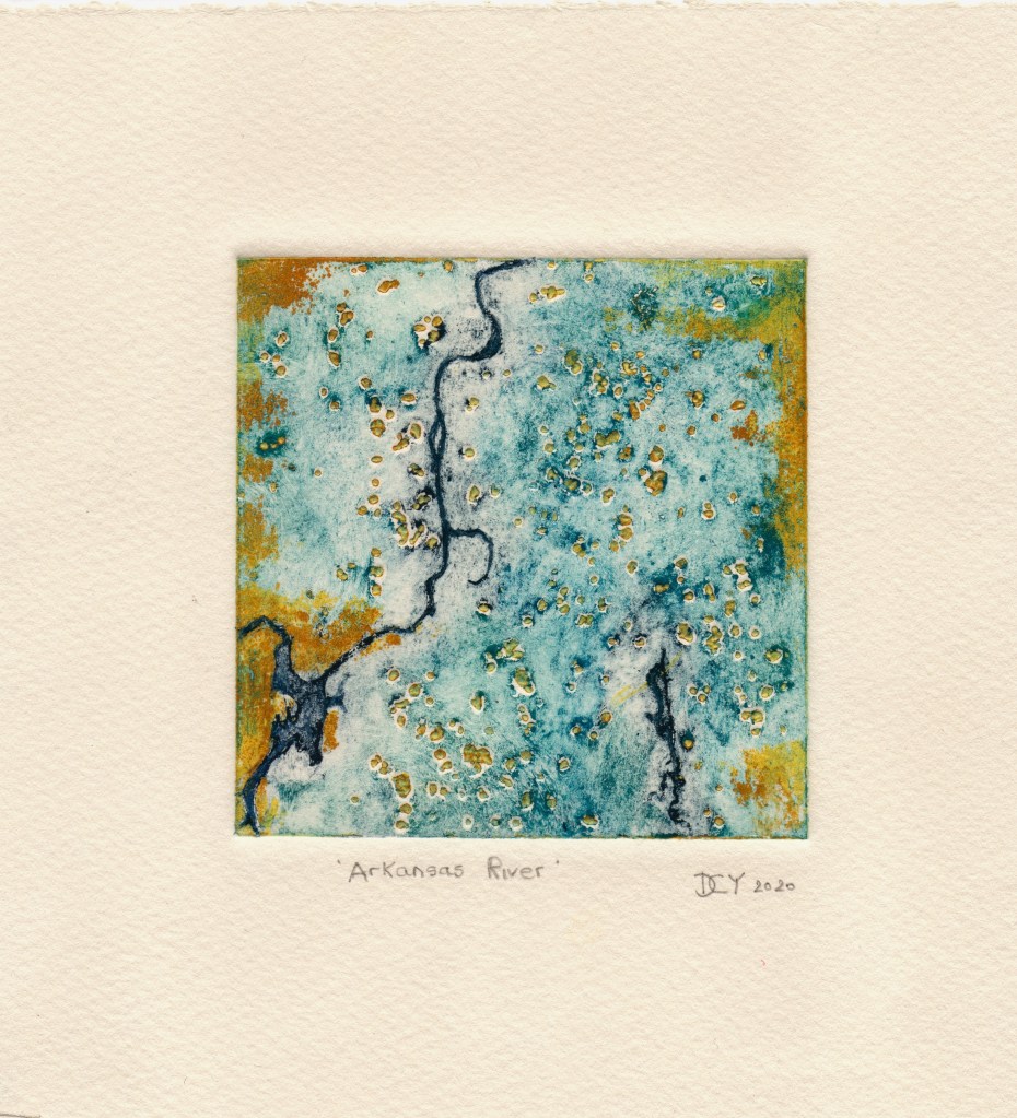
I am inclined to representative work, I love making images of animals and birds. But then I can get a momentarily distracted by other ideas I am interested in too and head off in a different direction. I really would like to do a series based on images produced by NASA earth observatory. They have this amazing website of beautiful images from space being continually updated. I am as fascinated by these as I am fascinated by drone imagery of our coastline here in the UK; seeing the landscape from above and then understanding it from the ground is really interesting to me.

The work below is the Arkansas River from space. This sort of work moves me toward the abstract and helps me exercise less restraint on my colour combinations.

NASA earth observatory images here

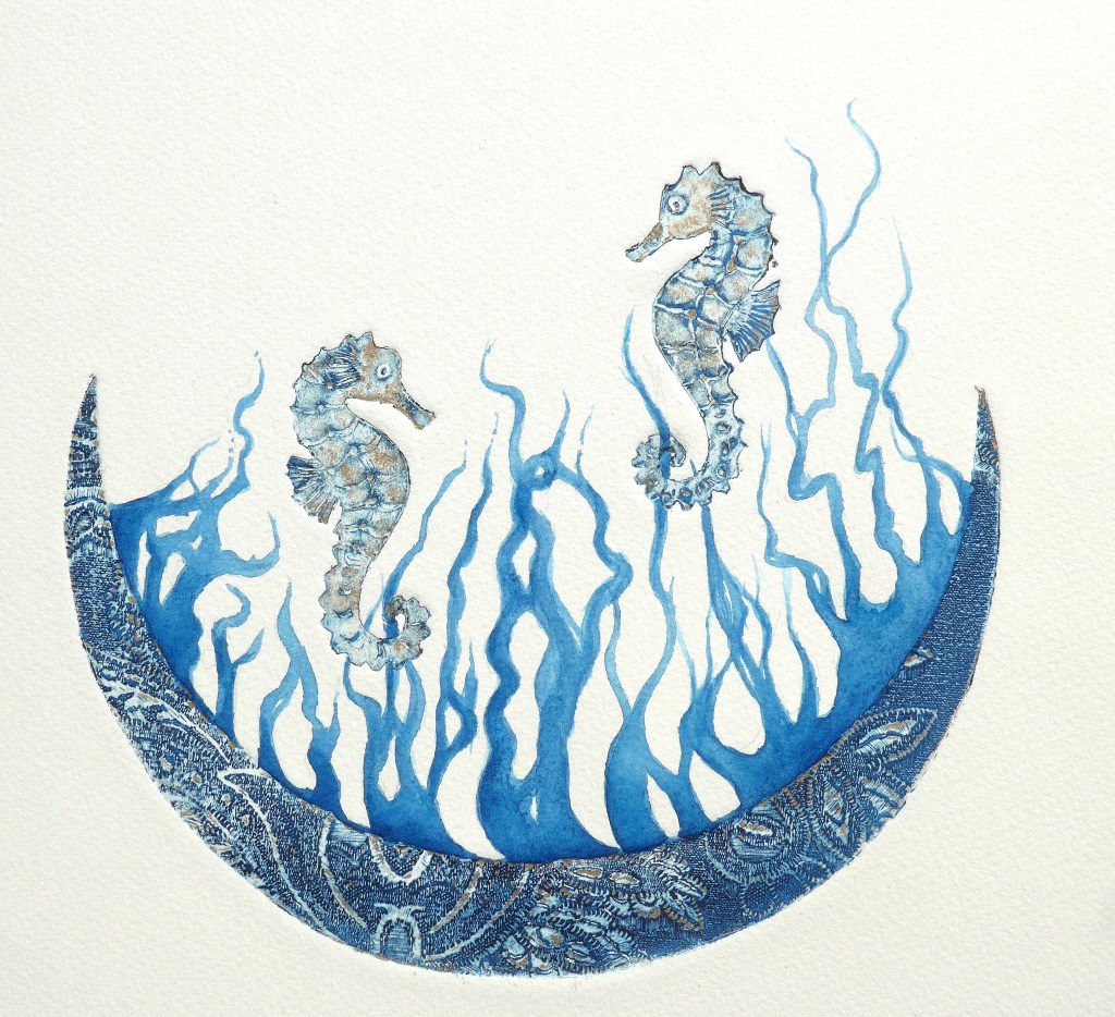
The original artwork below is £45 for sale online here

Advertisement


Leave a comment

#Collagraph #Printmaking Process tips

This image has an empty alt attribute; its file name is royal-star-plate.jpg

I have made a rubbing of my mountboard plate by lying layout paper (which is very thin) over the top of the plate and using a graphite pencil to get an impression.

I scan or photograph the rubbed image onto my PC and open it in Photoshop. Since the lights and darks of rubbing itself are the opposite of what my final print will look like I invert the black and the white in Photoshop to see what it looks like.

This gives me a very good idea of where the lights and darks will be when I do my final Collagraph print.

Rubbing using graphite pencil over the plate
Blacks and Whites inverted in photoshop

See now how the wing is now the highlight and the underside, eye area and lower beak is dark.

On the plate itself these highlights also have wood glue (or you can use PVA) which help to create brighter highlights on the finished print.

I am happy with this; now for the inking and printing!


Leave a comment

Sundarbans #Seahorses

I am trying to hold back on this work in progress and not ruin it by any rash decision making.

The seahorses and the arc are collagraph print, and what appears as coral is watercolour based on the pattern made by the Sundarbans where hundreds of rivers meet the Bay of Bengal.


2 Comments

Sense of Place : Venacher Stag

This is an original collagraph print made from a combination of my photo of Venacher Loch in the Trossachs placed as textures of the trees and the loch within in the form of a rutting stag. These beasts naturally inhabit both the Highlands and the North Lowlands of Scotland. We were there in 2017 visiting friends when we went to Venacher Loch for a walk and a lochside supper when I took the photo; such a serene and beautiful location.

Venacher Loch at sunset 2017


Leave a comment

Greedy #Rooks on Dartmoor. Fun with the WordPress new editor!

I have just managed to get totally distracted by this new editor, trying out all the new blocks for text, images, galleries, calendars and lots more. I was supposed to be checking out some photos on my PC of a trip to Dartmoor a few years ago as I want to integrate a Dartmoor scene with a rook profile.

Now I am back on track I have popped some photos in the new editor’s gallery below. Just click to enlarge and get a close up of these Rooky characters. As we drove over the moors the cheeky rooks were waiting in the pull-ins up on the hills and making begging noises for bits of sandwich! It was a great photo opportunity for me. They are such characterful birds.


Leave a comment

Blueprints #prussianblue #collagraph #printmaking #

It is coincidental that a printmaker’s single colour choice is often prussian blue and that this happens to be one of my favourite painting colours.   Keeping the inks simple is best for me at the moment whilst trying to get the shade via the texture right, as well as the consistency of the ink, the paper and the press!  Prussian blue’s history is extremely varied; if you are mad about colour history there is plenty of very interesting facts about Prussian Blue here.


Leave a comment

What’s not to like about lichen?

In the Cotswolds lichen seems to be a bit difficult to find, plenty of moss but no obvious lichen, until you find it on your door step in a little packet sent from a kind friend in Scotland where it is in abundance.

I have to get a plan together quickly before it deteriorates!

Photo of moss and lichen sent from Scotland to the Cotswolds for Diane Young ARtist in Stroud