I have made a rubbing of my mountboard plate by lying layout paper (which is very thin) over the top of the plate and using a graphite pencil to get an impression.
I scan or photograph the rubbed image onto my PC and open it in Photoshop. Since the lights and darks of rubbing itself are the opposite of what my final print will look like I invert the black and the white in Photoshop to see what it looks like.
This gives me a very good idea of where the lights and darks will be when I do my final Collagraph print.
Rubbing using graphite pencil over the plateBlacks and Whites inverted in photoshop
See now how the wing is now the highlight and the underside, eye area and lower beak is dark.
On the plate itself these highlights also have wood glue (or you can use PVA) which help to create brighter highlights on the finished print.
I am happy with this; now for the inking and printing!
I am trying to hold back on this work in progress and not ruin it by any rash decision making.
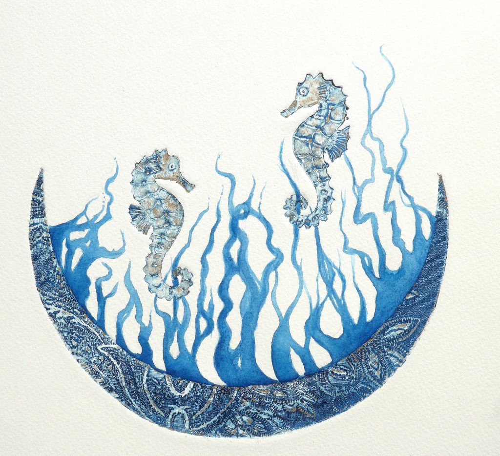
The seahorses and the arc are collagraph print, and what appears as coral is watercolour based on the pattern made by the Sundarbans where hundreds of rivers meet the Bay of Bengal.
Happy Easter weekend! Sometimes it is better just to go for it and create a small piece of art especially if you are procrastinating a bit, so here is my funny little egg print.
It is coincidental that a printmaker’s single colour choice is often prussian blue and that this happens to be one of my favourite painting colours. Keeping the inks simple is best for me at the moment whilst trying to get the shade via the texture right, as well as the consistency of the ink, the paper and the press! Prussian blue’s history is extremely varied; if you are mad about colour history there is plenty of very interesting facts about Prussian Blue here.
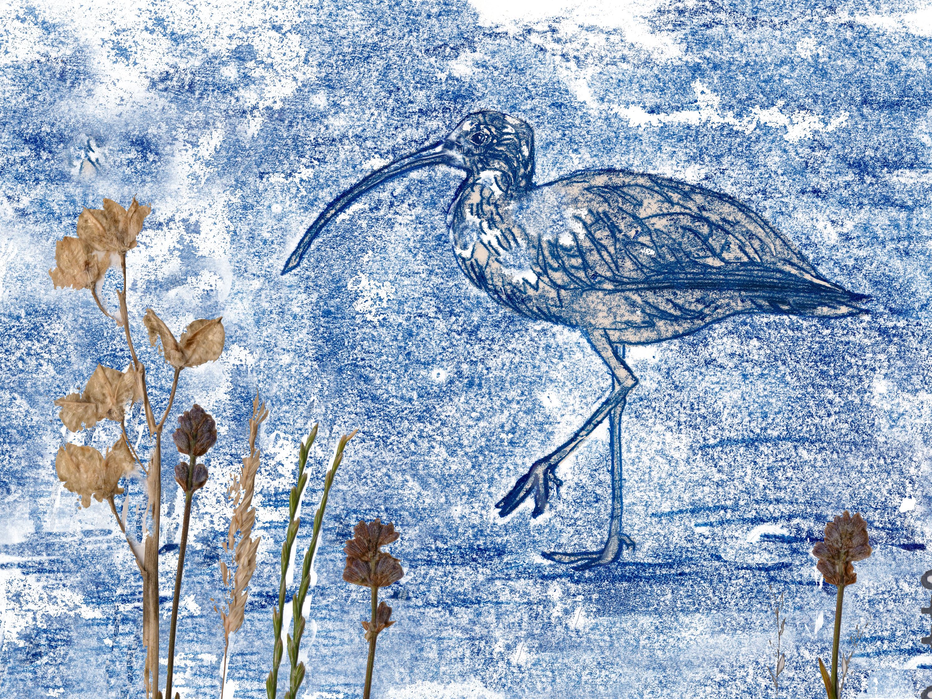
Northumberland and the Scottish borders yielded some great scenery for me and lots of birds on the shore and the islands. I bought a card with a print of Lindisfarne on it and was inspired to try these collograph and monoprints.